
Nourify is a health-tech app that delivers personalized nutrition and sleep insights based on smartwatch data. This project was part of a collaboration between Hochschule München and startups from the Strascheg Precelerator program. My focus was to improve the user experience, clarify visual communication, and make the app more modern, intuitive and motivating.
The Challenge
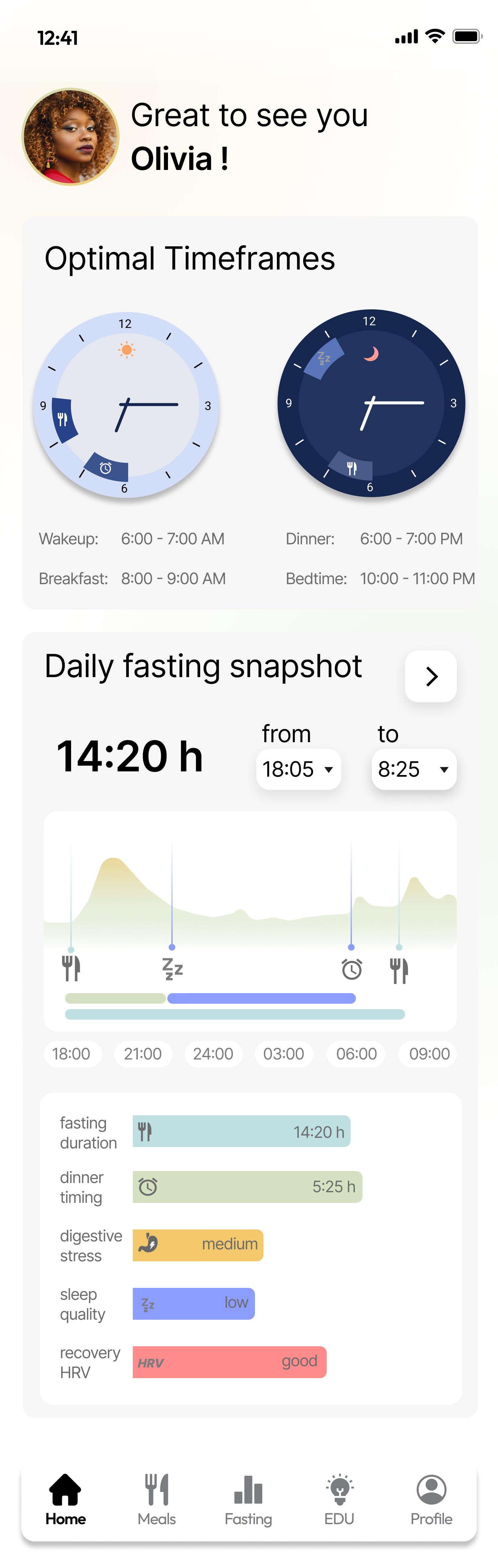
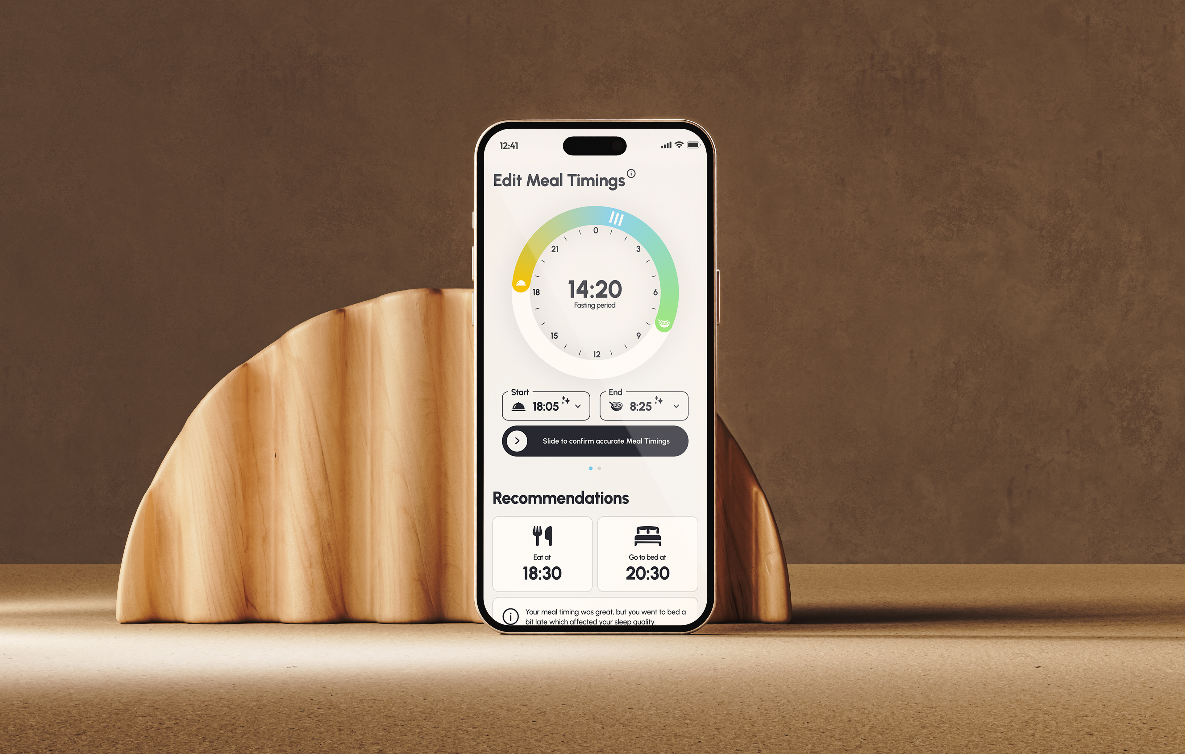
While Nourify offered strong functionality, the initial UI lacked visual clarity and overwhelmed users with confusing graphs and unclear structure. Key insights like optimal meal and sleep timings were not well communicated. Nourify integrates data from Garmin smartwatches to track sleep quality, fasting windows, and the nutritional impact on sleep and recovery. The app uses a proprietary algorithm to automatically detect when users went to bed or ate, but this wasn’t clearly communicated in the original design. These predictions also aren’t always accurate, users need the ability to manually confirm or adjust them — a process that, in the initial design, was unintuitive and poorly communicated.
My task was to rethink the app’s structure, improve readability, and ensure that these AI-driven insights were easy to interpret, adjust, and act on.
Initial Design
The Solution
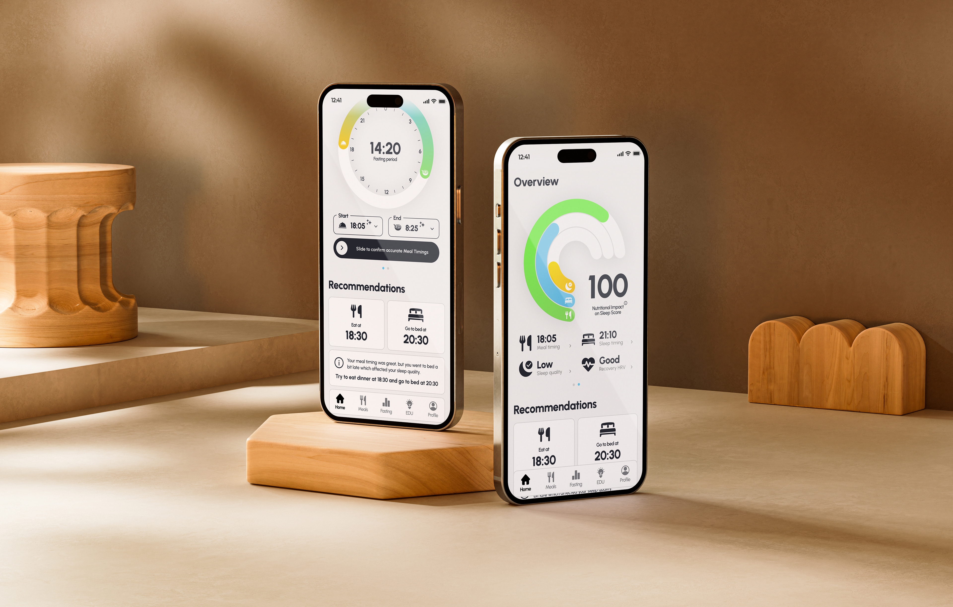
I redesigned the dashboard to bring clarity and structure to Nourify’s most important features. A key part of this was improving how the app presents AI-generated predictions based on Garmin smartwatch data. Start and End times for meal time predictions are now clearly labeled with stars icons. Users can easily adjust these and confirm them through a smooth sliding interaction.
These updates were developed through UX audits, wireframes, and constant feedback from the startup team, resulting in a more focused layout, improved hierarchy, and a more understandable user experience.
Thank you to Lukas and his team for the opportunity to contribute to such a meaningful product!